Pantone’s Color of the Year: Viva Magenta

January 10, 2023
The Pantone Color of the Year is the color that represents us at this moment in time. It’s like a snapshot of our culture. It reflects all that we’re doing and experiencing. It helps us understand where we are in the world. And what better way to understand your place in this world than by looking at color?
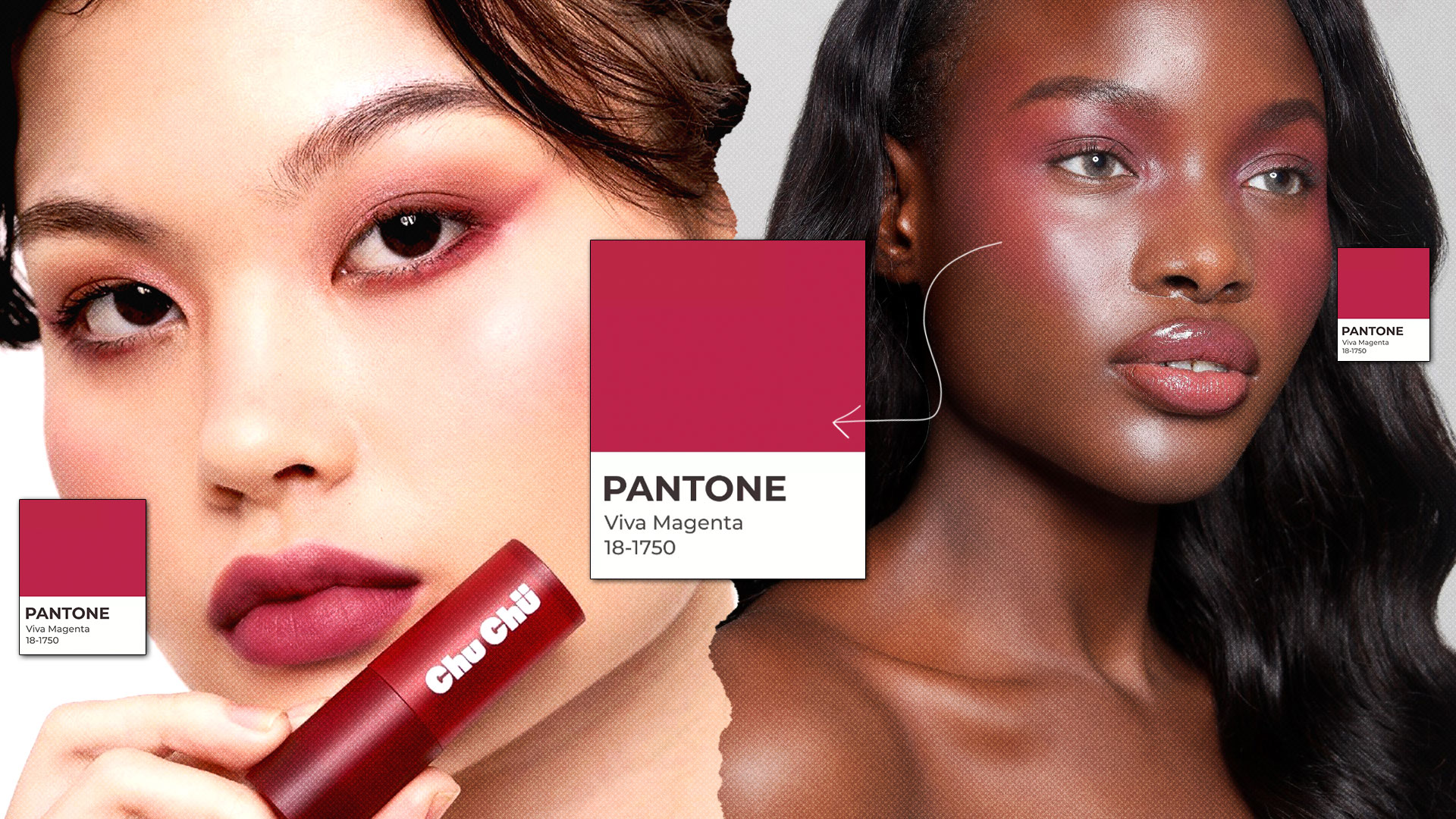
This is your chance to learn about the color trend that will impact fashion, beauty, interior, and all aspects of design over the next year. In a world of social media, artificial intelligence, and e-commerce, the need for physical interaction has increased significantly. This is why Pantone’s Viva Magenta is the perfect shade for 2023 — and for what it symbolizes.
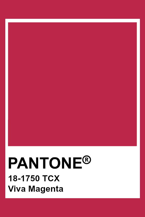
The brand depicts the shade as a “crimson red tone that presents a balance between warm and cool.” Leatrice Eiseman, Executive Director at the Pantone Color Institute shares “PANTONE 18-1750 Viva Magenta descends from the red family and is inspired by the red of cochineal, one of the most precious dyes belonging to the natural dye family as well as one of the strongest and brightest the world has known. Rooted in the primordial, PANTONE 18-1750 Viva Magenta reconnects us to original matter. Invoking the forces of nature, PANTONE 18-1750 Viva Magenta galvanizes our spirit, helping us to build our inner strength.”

WHAT’S THE STORY BEHIND PANTONE’S COLOR OF THE YEAR?
The institute wanted to draw attention to how culture impacts color, and how what is taking place in our global culture is expressed and reflected through the language of color. This thought process rings true today just as it did back in 1999 when it started. That’s one of the major reasons why so many always look forward to the Pantone Color of the Year announcement.
Just as the fashion industry decides what styles will be “in” for the upcoming year, Pantone can determine which colors are being talked about and used around the world in a variety of design disciplines. In fact, if you look around right now, odds are good that there’s a Pantone color right in front of your eyes. It could be on the walls of your house or office, in your car, or even on the clothes that you’re wearing today! Pantone is known as the authority in color standards and its insight has become an international benchmark for industry leaders in a variety of fields.
WHO CHOOSES THE COLOR OF THE YEAR FOR PANTONE?
They have an entire team of experts who scour through everything from fashion trends to technological advances in order to find the perfect color for each year. For example, if you look back 15 years ago, technology would have played a smaller role in their selection process—but today that’s changed entirely! Gaming, social media, AR, and physical design itself are all influenced by our technology and the colors they can access in a digital environment.
It’s true that the Pantone Color of the Year selection process isn’t just a bunch of people in a room making a decision.
It’s more like a bunch of people in a room over time making decisions.The Pantone Color Institute team is constantly thinking about color and design. The truth is that they don’t meet in one room and emerge with a decision. Instead, their global team involved with the Pantone Color Institute conducts year-round trend analysis that informs the selection. As well as the colors that get included in their color trend forecasting products. So really, it’s just one long conversation among a group of color-attuned people.
Their team members come from a wide range of design, cultural and geographical backgrounds. The commonality that brings them together is their expertise in color and design, and their ability to see the world through the lens of color.
Pantone’s Color of the Year isn’t just about the color. It’s about everything that happens in our culture during the year—and how the world is responding to it. Pantone has been making these announcements for over 20 years now (and they’re pretty good at it).
The name needs to be meaningful and easily convey the message they want to send about their selection. They want it to be intuitive and connect immediately with the world.
HOW WILL PEOPLE USE VIVA MAGENTA?
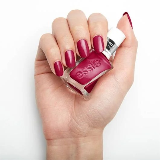
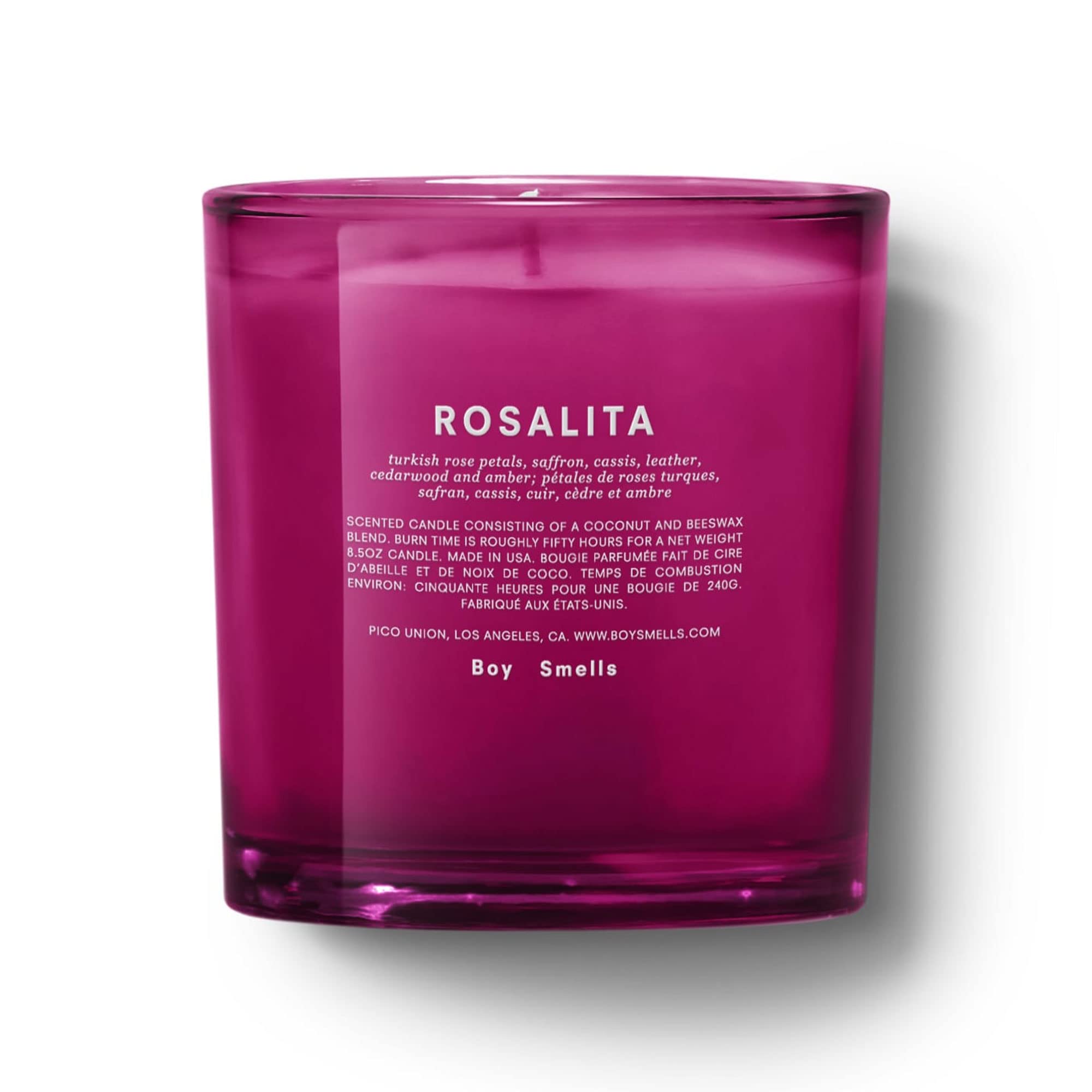
I know what you’re thinking: How do I use Viva Magenta? You can use it on social media marketing, logos, printing materials, walls, makeup, accessories, fabrics, and textiles… even on food! The possibilities are endless! Check out my January 2023 Beauty Picks.
Since the announcement just came out today, you might not find so many items in this shade but keep a look out for more options are the year progresses. Here are a few places we’ve seen this trend start to take place:


WHAT DO YOU THINK ABOUT VIVA MAGENTA?
Pantone’s Color of the Year has played a major role in color forecasting and the design community. Helping shape global trends and define the design world. At the same time, Pantone’s colors which have been named for years have been around for quite some time in the industry. I’m excited to observe where we’ll see Viva Magenta popping up. Have you seen it anywhere?